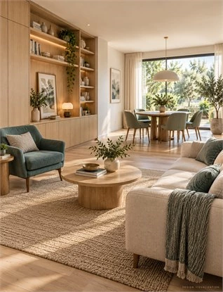
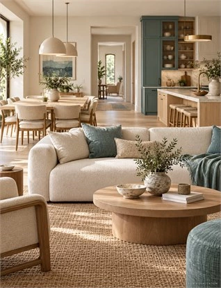
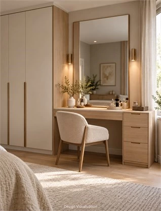
A successful whole-house color scheme begins with the finishes you will keep, then gives the proposed colors and materials clear roles across connected rooms. Establish a shared background, choose the elements that will repeat, and decide where each room can vary. Review cabinets, doors, walls, and flooring together before approving them separately.
Continuity does not require identical rooms. A wood detail in an entry cabinet can relate to bedroom storage, while a selected accent changes from cabinetry in one space to upholstery in another. The important question is what someone sees from the entrance, living area, and doorways as they move through the home.
This guide explains how to make those decisions using a room coordination table, transition checks,ks and two published ALLURE project references. It addresses the home's overall palette rather than prescribing paint products or a universal color formula. Use the examples to develop your own direction, then test it with physical samples and the actual rooms.
Start with the Home You Already Have
Begin with a room inventory rather than a folder of favorite colors. Existing surfaces determine what the new work must meet, and the same retained finish may be visible in several rooms.
Identify the Fixed Elements That Will Remain
List retained flooring, doors, stone, tile,ile and substantial furniture. Mark each on the plan and note the surfaces visible beside it. Include a prominent sofa, rug or artwork if it is staying and strongly influences the room. Keep “retain,” “replace,” and “undecided” separate so the scheme does not quietly depend on an unapproved replacement.
For example, if a brown-toned floor continues from the entry into the living area, review both cabinet proposals against that actual floor. Selecting each cabinet from an isolated screen image can leave the connection unresolved even when both choices are attractive individually.
Separate New-Build Decisions from Partial-Renovation Decisions
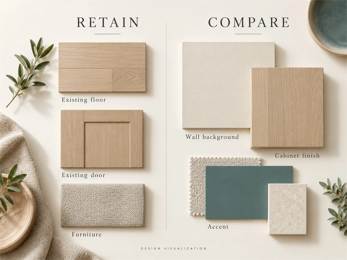
In a new build, review proposed floors, doors, walls,s and cabinetry as a combined set before the largest selections become fixed. In a partial renovation, the retained elements are the starting references. Identify the visible junctions where new work meets old: a cabinet beside an existing frame, a new panel against old flooring,ng or a changed wall behind retained furniture.
If a proposed cabinet finish seems incompatible, compare an alternative before assuming the floor or door must change. Keep the cost and scope implications of replacing those elements separate from the visual decision. A coordinated update need not become a whole-house replacement project.
Review Lighting and Connected Views
Photograph normal viewpoints: the entrance, the sofa, the dining table and the corridor. Mark which cabinet fronts, doors and floors appear together. A kitchen and dining cabinet in the same view need a different comparison from a wardrobe behind a normally closed bedroom door.
Record the daylight and installed lighting used when the rooms are occupied, including evening conditions. These become the locations for checking samples later. Photographs help communicate the relationships, but the camera and display are not the final color reference; keep the actual retained surfaces available for comparison.
Build a Shared Base Palette, Not Identical Rooms
Give each part of the palette a job. A shared background supports the larger composition, a repeated material connects selected areas, and an accent attracts attention where you intend. The balance should follow the actual views rather than a mandatory number of colors.
Choose the Background That Connects the Home
Review the largest visible surfaces together: walls, major cabinet banks, flooring, and repeated door faces. Decide which should provide a relatively quiet backdrop and which already carries pattern or contrast. A background may use related tones across different surfaces without requiring an exact match between paint and cabinet material.
Start with a representative large view rather than choosing a separate neutral for every room. If a cream-led direction appeals to you, the cream interior ideas guide offers a more specific style reference. Test that direction against your retained finishes instead of assuming the color name guarantees compatibility.
Give Wood, Stone and Cabinet Finishes Distinct Roles
Choose which material relationship will repeat and where. For instance, a wood-toned entry detail might relate to a dining cabinet while larger painted surfaces provide the background. In another home, retained stone may be the strongest reference and cabinetry may play a quieter role around it.
Assess the extent and placement of each finish on the elevation. A small sample does not show how much of the finished room it will occupy. If you are considering an earthy direction, use the earth-tone interior guide for inspiration, then assign the selected references to actual surfaces rather than adding every suggested tone.
Plan Accents Across Several Rooms
Decide where the accent begins, where it reappears, and where it stops. A colored cabinet section might connect with a chair or textile in another room; it does not need to become the color of every wardrobe and door. Identify the quieter surfaces that allow the selected feature to remain legible.
Mark these roles on a whole-home plan. Label repeated elements as well as intentional changes, using words and patterns alongside color. This makes the proposal understandable even before exact finishes are approved, and prevents a new accent from appearing in every room simply because it was chosen first.
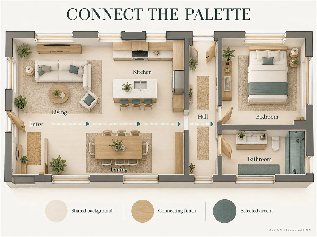
Connect the Entry, Living Room, Dining Area and Kitchen
Review shared spaces as one sequence before refining each cabinet. The goal is to understand the surfaces seen together and establish which ones repeat, support,rt or contrast with the others.
Plan the First View from the Entrance
Stand at the entrance and identify the first visible cabinet, interior door, and surface beyond them. Decide whether the entry storage should blend with the background or introduce a finish that returns farther inside. Include the retained floor or stone that frames this first view.
If the entrance already contains a strong pattern, compare a quieter cabinet proposal before adding another focal point. If the view is restrained, a selected wood or color detail may provide an introduction to the wider scheme. Judge the full view, not the entry cabinet photographed alone.
Coordinate the Cabinet Elevations Seen Together
Mark the TV unit, dining cabinet and kitchen elevations visible from normal seating and circulation positions. Compare their surface extent, grain, sheen and color alongside the dining table, sofa, appliances and stone. Decide which cabinet should lead the view and which should support it.
A useful revision request is specific: retain the kitchen direction, simplify the visible dining elevation, or repeat one selected detail in the living-room storage. Changing one relationship at a time makes the comparison clearer than introducing a different palette for every cabinet group.
Build a Whole-Home Coordination Table
Use a room table to keep the decisions connected. The framework below is illustrative, not a specification for either featured project. Replace the entries with your retained elements and proposed samples, and record the views that must be reviewed before approval.
| Room or view | Retained elements | Background direction | Cabinet and door relationship | Accent role | Review before approval |
|---|---|---|---|---|---|
| Entry | Existing floor and retained doors | Establish the initial backdrop | Blend storage into it or introduce a connecting finish | A selected feature or repeated detail | Entrance view toward the next space |
| Living room | Sofa, floor and major furniture | Relate large surfaces to the entry | Coordinate storage with visible dining and kitchen elevations | A chosen furniture or cabinet element | Normal seated views |
| Dining area | Table and adjoining floor | Continue or deliberately change the shared backdrop | Review dining storage beside the table and kitchen | Upholstery, display or a defined cabinet section | Table, storage and kitchen in one view |
| Kitchen | Retained stone, floor or appliances | Assess it within the public-space composition | Assign roles to perimeter, island and tall storage where present | A selected element with a clear stopping point | Full elevation and adjacent room |
| Hallway | Doors, frames and flooring | Support the route between rooms | Decide what repeats across openings | A restrained linking detail if needed | View with relevant doors open |
| Bedroom | Bed, floor and retained textiles | Allow a distinct private-room direction | Connect wardrobes or doors through selected references | Bedding or a chosen built-in detail | Hallway view and room interior |
| Bathroom | Tile, stone and fixtures | Relate visually while specifying materials for the location | Review vanity and doorway together | A controlled cabinet or accessory color | Threshold view and actual samples |
Illustrative partial update: a home retains brown-toned flooring, dark door frames, and a blue sofa. Compare the proposed entry, dining, and kitchen samples against those references in one set. Keep the sofa's color in the review without automatically repeating blue on every cabinet. A bedroom can take another direction if its doorway and selected linking details make the transition intentional.
Let Bedrooms and Bathrooms Keep Their Own Character
Private rooms can vary while remaining part of the same home. Review how much of each room is visible from outside, then choose which connection to retain and which characteristics belong to the room itself.
Carry Selected References into Bedrooms
Start with the retained bed, flooring,g and textiles before choosing the wardrobe finish. You might carry a wood reference from the shared areas into a smaller bedroom detail while letting the wardrobe blend with its own wall direction. Alternatively, the wardrobe may provide the connection while the bedding supplies the variation.
Discuss each user's preferences rather than assigning identical wardrobes throughout the home. The test is whether the chosen relationship makes sense in the doorway view and within the bedroom, not whether every room uses the same list of finishes.
Connect Bathrooms Visually While Specifying Them Separately
Review bathroom tile, stone, fixtures,es and vanity samples as their own material set. Then place the relevant adjoining dry-room references beside them. A related tone, degree of contrast, or selected detail may provide the connection without repeating the same surface product.
Confirm material suitability, care and installation through the actual product information and project conditions. A visually continuous palette does not establish that an indoor wall panel or floor assembly is suitable for a wet location. Keep that technical assessment separate from the desired color relationship.
Decide Which Differences Need a Transition
Compare an enclosed room with a doorway routinely visible from the living area. In the second situation, review the frame, door leaf, and first visible interior surface together. One related element may be enough to connect a distinctly different room; another room may benefit from a gentler change in the background.
Use a view containing both spaces to make the decision. If each room looks convincing alone but their junction feels unresolved, revise the boundary or linking detail before changing the entire room palette. Keep deliberate differences that the client values.
Coordinate Wood Tones, Stone, Metals and Textiles
Color names are only a starting point for material selection. Compare the actual visible surfaces and their roles, then confirm construction and suitability separately. A cohesive interior color scheme can contain different materials without pretending they are identical.
Compare Wood Undertones, Depth and Grain
When matching cabinets and flooring, decide whether you want a close visual relationship, a complementary combination, or deliberate contrast. Put the cabinet sample beside the floor and compare apparent warmth, depth, grain activity, and sheen. An almost-match that feels accidental may be less useful than a clearly chosen difference.
Review a representative door or elevation when a small piece cannot explain the proposed surface. Do not infer wood species or stain identity from a photograph. For the separate choice between an opaque appearance and visible wood character, see the painted-versus-stained cabinet guide.
Give Stone and Other Patterned Surfaces a Clear Place
Compare the proposed stone pattern with wood grain, textured panels,s and any retained patterned floor. Identify which should draw attention in the important view. If several surfaces appear equally active, test a quieter surrounding finish before adding another feature.
Where material variation matters, review representative actual pieces and the supplier's selection information. Assess the orientation and intended extent of the surface. A digital mood board can communicate the desired relationship, but it cannot verify the stone or pattern that will be supplied.
Include Metals, Glass and Textiles Early
Gather the visible handle, frame, track,ck and lighting-finish references relevant to the proposal. Include retained upholstery, curtains and rugs rather than treating them as unrelated decoration. Decide which smaller details should repeat and which can differ without competing in the same view.
For glass-front cabinetry, consider the visible contents as well as the frame. A display changes when filled with everyday belongings. Review those conditions before approving the composition, instead of relying on an empty cabinet image that omits part of the eventual palette.
Use Room Transitions to Control Contrast
Doorways, corners, and adjoining surfaces are where independent selections meet. Mark the intended changes on the plan and elevations so continuity is designed at the junction, not left to be resolved during installation.
Use Doors and Frames as Deliberate Transitions
For interior door color coordination, compare the door leaf, frame, surrounding wall,l and nearby cabinetry together. Decide whether the opening should blend with the wall, relate to a cabinet finish, or provide a controlled contrast. Review both the open and closed positions from the normal viewpoints.
A door between two different room palettes needs attention on both sides. Assess the actual product construction and finish options before assuming either face or frame can take a selected treatment. The interior door collection provides product directions to discuss, not a guarantee of an exact match to every wall or cabinet.
Decide Where a Color or Material Should Stop
Identify a deliberate boundary for each change: a complete cabinet group, an actual corner, an opening,g or another appropriate architectural junction. Mark whether a feature remains within one unit or continues into adjoining paneling. Review the stopping point in the connected view.
If a contrasting cabinet finish ends mid-composition because two suppliers worked from separate selections, the result may not reflect either original intention. Give the teams the same transition reference before approving their respective components, while keeping their supply responsibilities clear.
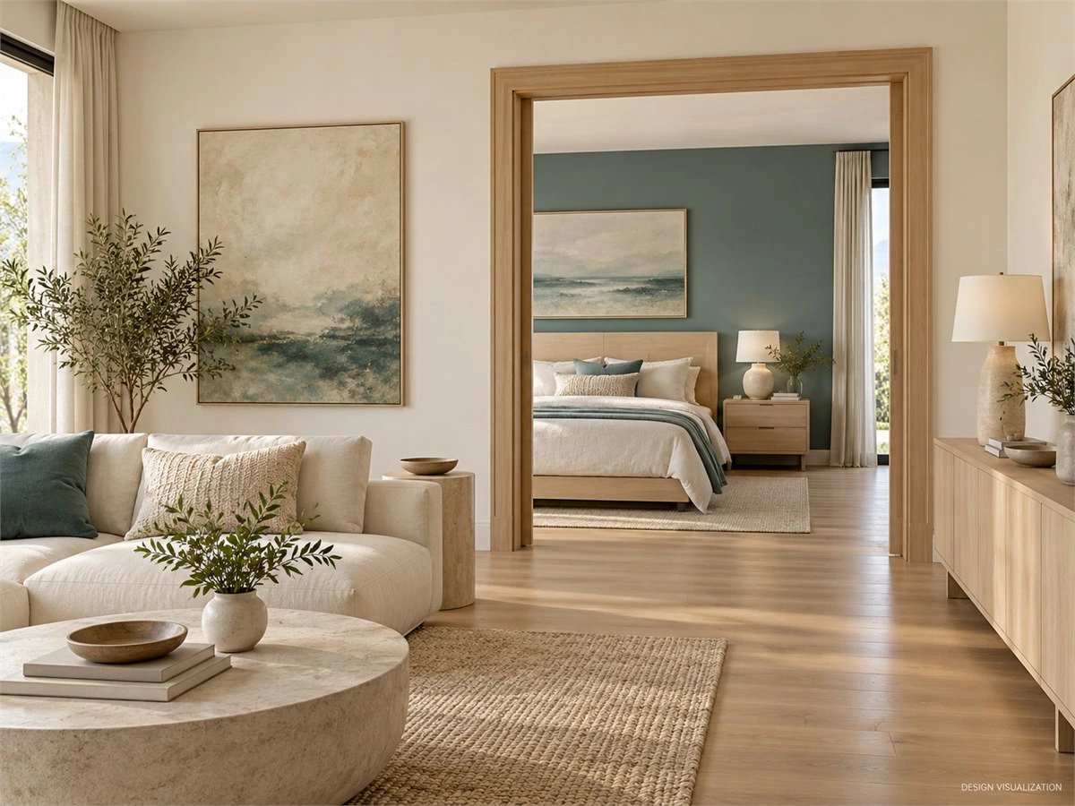
Review the Home as a Sequence of Connected Views
Walk the proposed sequence rather than reviewing only a collection of attractive room images. Use the actual home where possible, or mark the viewing positions on the plan for a design review. At each position, name the repeated reference, the intended change, and any unresolved combination.
- Start at the entry and look toward the first shared space.
- Review the living room from its normal seating position.
- Look toward the dining cabinet and kitchen elevations visible together.
- Follow the hallway and compare relevant doors and frames.
- Review bedroom and bathroom thresholds with their doors in normal use positions.
If the sequence breaks at one view, revise the specific surfaces that meet there. This is more targeted than restarting the palette for rooms whose relationships already work.
Compare Two Real Whole-Home Directions
The following published ALLURE projects illustrate different ways to coordinate a home. Compare their stated design relationships, not exact shades or material identities inferred from images. They are separate projects, not alternatives designed or priced for the same property.
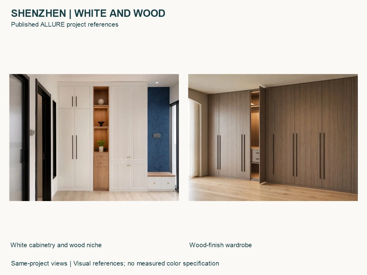
Shenzhen: White Lacquer, Wood and a Selected Navy Accent
The Shenzhen white-lacquer and wood project describes white storage combined with wood display sections, wood-finish wardrobes, a kitchen pairing white upper cabinets with wood lower cabinets, and navy built-ins. These are the documented relationships used here; the page is not a source for exact paint codes or a verified wood species.
The planning lesson is to let related finishes change their role. Wood can appear as a selected display detail in one cabinet and as the main wardrobe finish elsewhere. Before adapting the idea, check how that relationship meets your own flooring, doors,s and retained furniture.
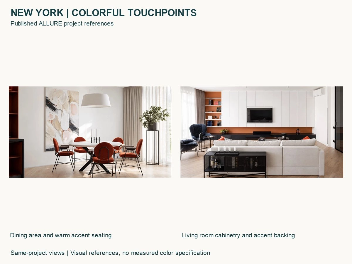
New York: A Light Foundation with Colorful Touchpoints
The New York colorful-cabinetry project describes a soft-white base and black hardware with red, blue,ue and orange cabinet elements. It also identifies yellow in the washroom and related colors in beds and chairs. That supports a discussion of color moving between cabinetry and furnishings, not a claim that every item was supplied under one package.
Here the transferable idea is the role of the background and selected colored elements. To adapt it, map the accent locations and their neighboring surfaces first. Do not treat the photographed colors as reproducible specifications or expand a selected detail across every cabinet without reviewing the new composition.
Compare the Strategies Rather Than Declaring a Winner
Choose the direction that answers your brief and retained conditions. If the floor already carries strong visual character, assess how either approach would sit beside it. If the client wants pronounced color, decide its location and extent rather than assuming the entire home must become more colorful.
| Decision | Shenzhen reference | New York reference | Test in your own home |
|---|---|---|---|
| Connecting foundation | Related white-and-wood cabinet combinations | A light foundation with black details | Compare against retained large surfaces |
| Room variation | Wood, white and navy take different roles | Selected colors recur in different elements | Review the variations visible from adjoining spaces |
| Accent approach | A navy built-in within the stated combination | Several documented colored touchpoints | Mark where accents begin, recur, and stop |
| What transfers | The relationship between finishes | The hierarchy between background and accents | Confirm physical samples and the actual composition |
The comparison is about decision methods. Neither project establishes a universal palette, measured color match, cost advantage, or required material combination for another property.
Test the Palette and Answer Common Questions
Once the direction is coherent, test the actual proposed combination. Keep inspiration, visual comparison, and final approval distinct so a persuasive presentation does not become an ambiguous specification.
Build One Connected Physical Sample Set
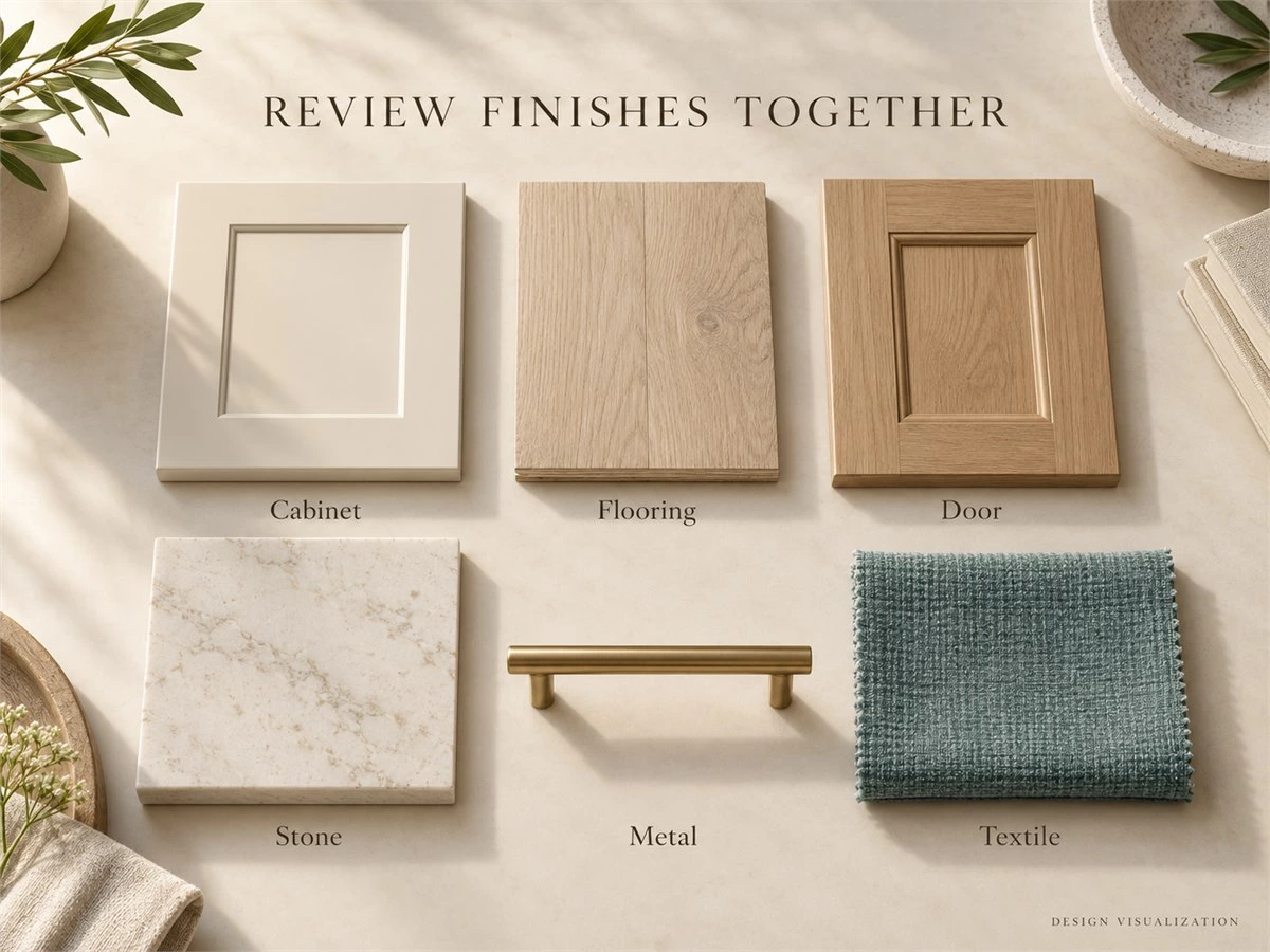
Gather the relevant floor, wall, cabinet, door, and stone references, then add the important metal and textile samples. Label retained elements and proposed selections. Where a small chip cannot explain a grain, pattern, or large surface, obtain a more representative reference before making that decision.
Compare the pieces in their intended relationships as well as laid flat. Put the cabinet reference beside the floor and door, and consider their installed orientation. A generated palette board can help communicate a concept, but it is not evidence of the actual materials or colors you will receive.
Check Daytime, Evening and Adjoining-Room Conditions
Take the sample set to the relevant rooms and compare it during normal daytime and evening use. Review each combination beside retained surfaces, then from the doorway or connected viewpoint that links the rooms. Keep the proposed lighting in the discussion if it is not yet installed.
Use the record below to identify a decision rather than collecting unlabelled photographs. If a combination is unsatisfactory only in one view, investigate the particular surfaces and lighting involved before replacing every selection.
| Check | Compare | Record |
|---|---|---|
| Retained finishes | Proposed sample beside the actual floor, door or stone | Retain the proposal, test an alternative or investigate further |
| Day and evening | The same combination under intended use conditions | Location, lighting condition and observed concern |
| Connected view | Adjoining surfaces as seen through the normal route | Repeated element, deliberate change and unresolved junction |
| Extent and orientation | Representative surface size, grain or pattern direction | Whether a larger or different sample is required |
| Next decision | Current proposal against the selected alternative | Responsible person, sample reference and approval status |
Move from a Design Direction to an Approved Record
After the palette is selected, identify which finish applies to each relevant room and component. Link it to the approved physical reference and required appearance information. Keep inspiration images separate from the references actually used for production review.
The cabinet finish schedule guide explains the detailed documentation stage. Here, the goal is to arrive at that stage with the color relationships resolved. A coherent visual direction still needs the actual material specifications, project responsibilities, and approvals behind it.
Should Every Room in a House Be the Same Color?
No. A whole home color palette can connect rooms through selected backgrounds, materials,s or details while allowing each room its own character. Review the elements visible together and decide what repeats. Enclosed bedrooms and bathrooms may vary more distinctly, provided their doorways and adjoining surfaces are considered.
How Can I Create a Cohesive Interior Color Scheme with Different Wood Tones?
Compare actual samples and give each wood tone an intentional role. Review warmth, depth, grain, and sheen beside the retained floor and neighboring finishes. Different woods do not need to imitate one another, but their combination should be assessed in the connected room view rather than selected from separate images.
Should Cabinets Match the Flooring?
They can match closely, complement the floor,r or create deliberate contrast. Start with the relationship you want, then compare the actual samples and the cabinet's planned extent. Similar names or screen colors do not establish a match. Keep the floor's pattern and other large surfaces in the same review.
How Should Interior Door Colors Relate to Cabinets and Walls?
Decide whether the doorway should blend into its background, connect to nearby cabinetry,ry or act as a controlled contrast. Review the leaf, frame, and surrounding surfaces in open and closed positions. A door connecting different palettes needs attention from both rooms, with its actual product options confirmed separately.
Can I Keep Existing Cabinets or Furniture When Updating the Palette?
Yes, retained pieces can become the starting references for the new scheme. Identify what stays and compare new surfaces beside those items. If alteration is proposed, assess the item's condition and suitability separately; a desired color relationship does not establish that an existing finish can be successfully changed.
Why Can a Color Look Different in a Photograph and in My Home?
Lighting, surrounding surfaces,s and the way an image is captured and displayed can affect the appearance you see. Use photographs to communicate direction and context, then review physical samples in the intended rooms. A digital image alone is not a reliable final approval reference for the supplied material's color and sheen.
Build a Whole House Color Scheme Around the Connections
Begin with what stays, assign the background and connecting finishes, then review the route between rooms. Allow variation where it serves the room, and define how each change meets the next space. Physical samples and connected viewpoints turn an attractive collection of ideas into a clearer whole-home decision.
Planning a coordinated palette for your home? Share your floor plan, photographs of the flooring, door,s and furniture you want to keep, and references showing your preferred overall direction. Discuss whole-home cabinetry and related product options with ALLURE within your project's confirmed scope, including which areas and components you want help coordinating.