The Best Color to Wrap Your Home in a Touch of Softness
Cream color is a warm color that falls between beige and white, closer to camel color, exuding a hint of sweetness. Compared to pure white, it has a richer and more mellow tone, while being less intense than beige. It presents a gentle and soft texture, revealing the charm of an exquisite and elegant space. If translated into home design, it definitely imparts a more soothing atmosphere to the space.
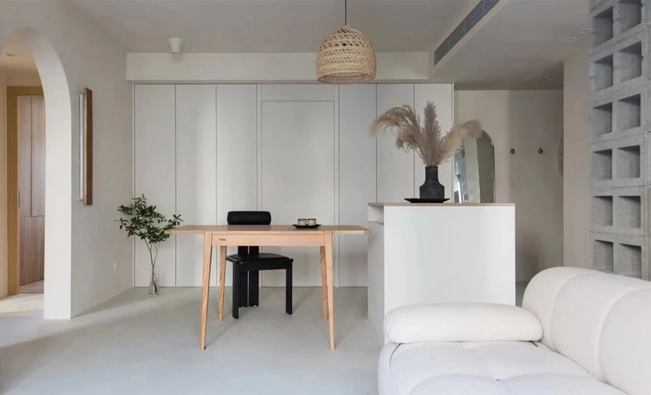
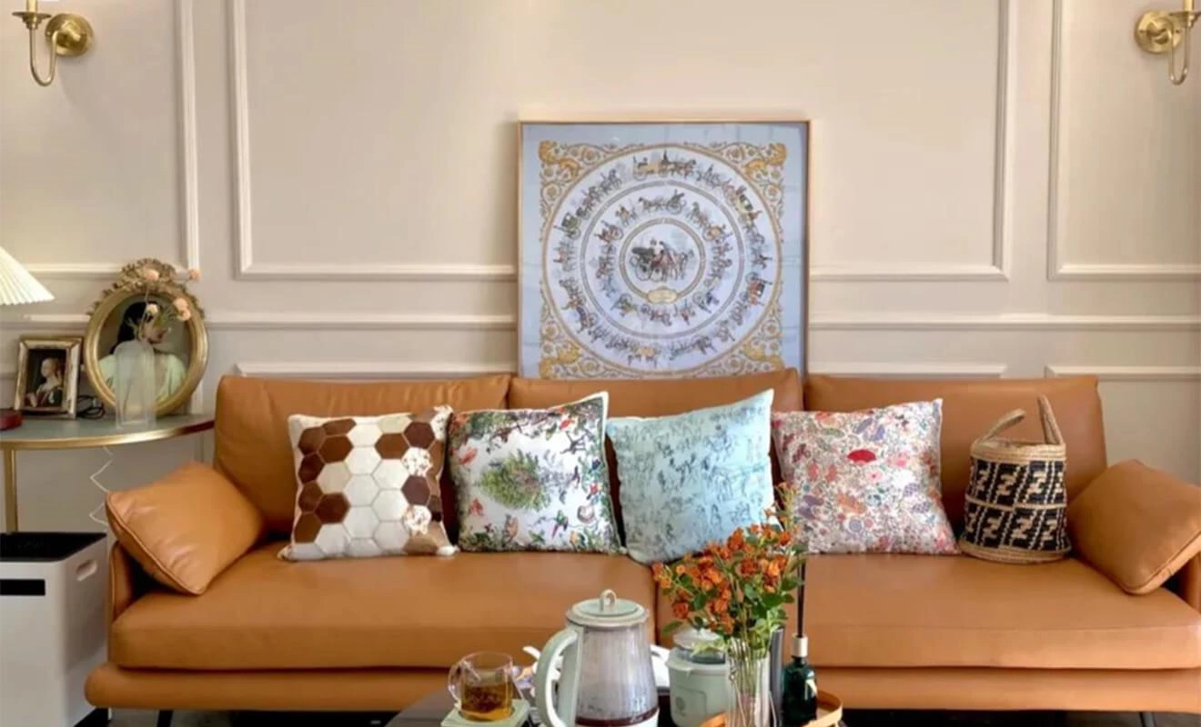
Cream-themed decoration, with cream, beige, and white as the main colors, showcases the transparency and cleanliness of the space, simple yet layered. The minimalist hard furnishings and soft furnishings work together to create a sense of unity in style. Being versatile, it can not only shine beautifully on its own but also mix and match with various styles to create new color combinations and demonstrate the beauty of eclectic design.
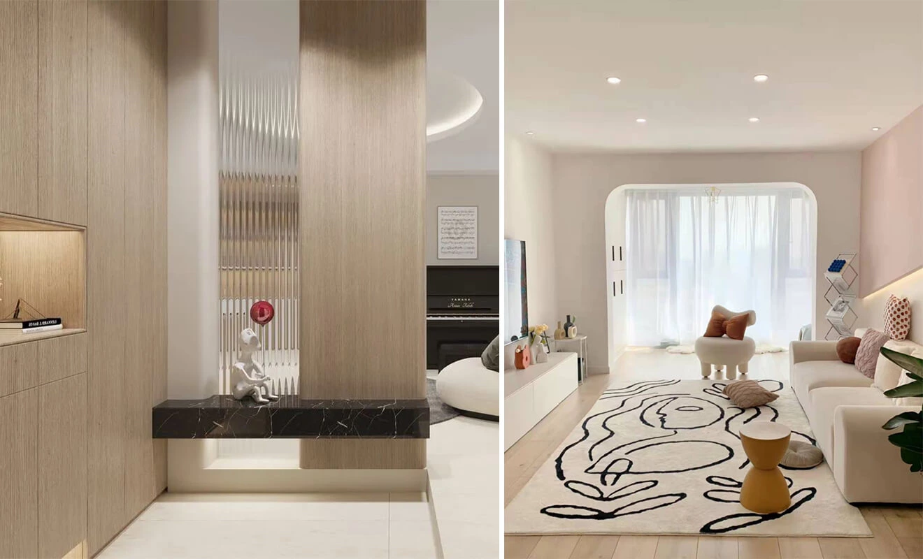
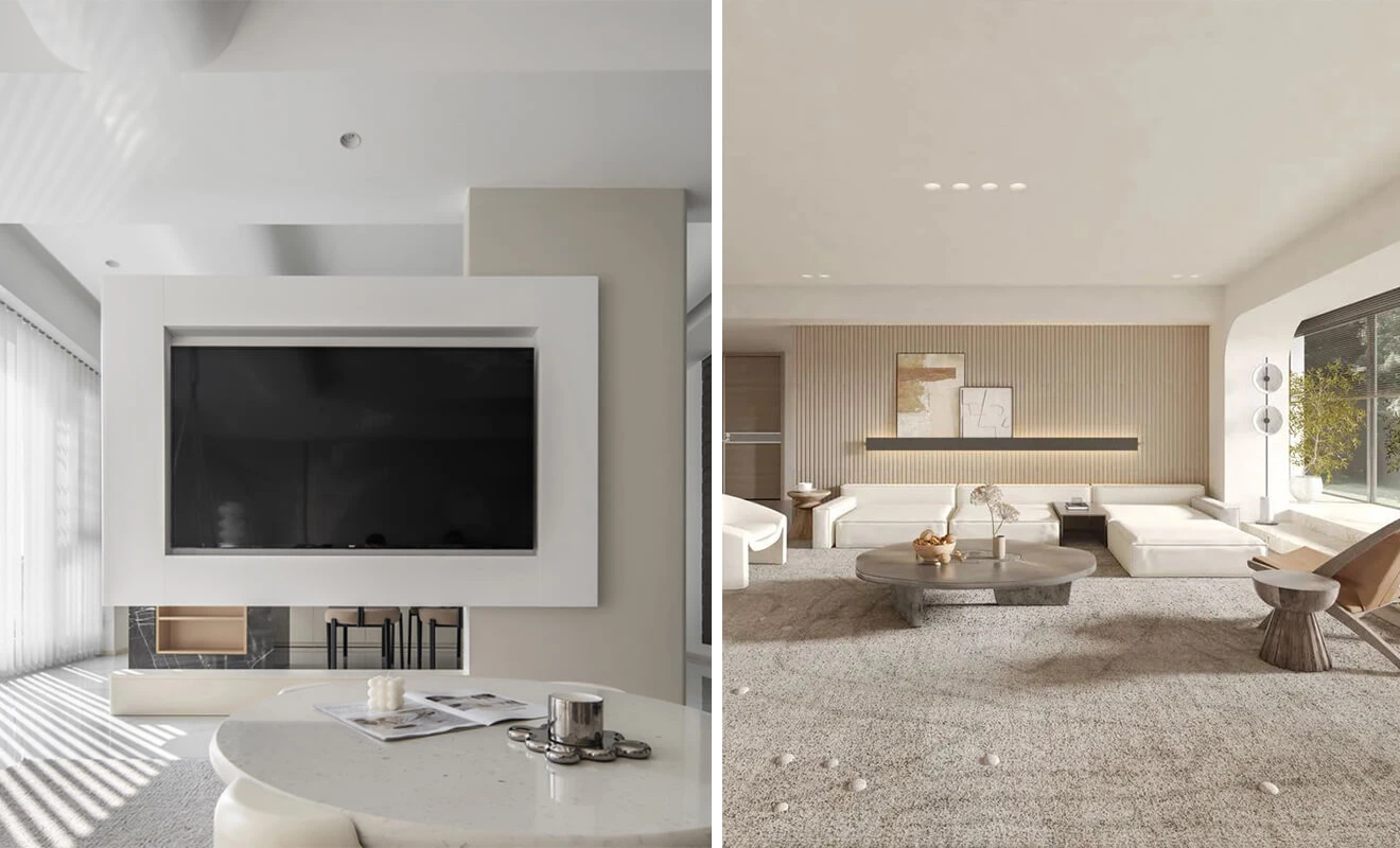
How to create a cream-themed home? We can start from the following three aspects:
Cream-colored home decor works when it has a clear color hierarchy. Instead of using one flat beige everywhere, combine a main cream tone with lighter whites, slightly deeper milk-tea or coffee accents, natural wood, and a limited number of metal or stone details. The room will still feel soft, but the contrast gives furniture, cabinets, and architectural lines a defined place.
Quick Guide to Cream Color Home Decor
| Design Element | Cream Color Role | Planning Priority | Useful Accent |
|---|---|---|---|
| Ceiling and Walls | Creates a soft, bright envelope | Undertone, daylight, and light-reflectance | Warm white, pale beige, or subtle texture |
| Flooring | Grounds the palette with warmth | Contrast with walls and long-term maintenance | Matte wood, light oak, or warm neutral tile |
| Cabinets | Adds a large, intentional color block | Door finish, hardware, and countertop pairing | Wood, brass, dark bronze, or stone |
| Furniture and Textiles | Creates layers and comfort | Texture, scale, and washable materials | Linen, wool, bouclé, wood, and soft gray |
| Lighting and Decoration | Controls mood and visual warmth | Color temperature, glare, and focal points | Warm lighting, plants, and restrained artwork |
Before finalizing a cream palette, look at samples in the actual room. The same paint, cabinet finish, or fabric can look more yellow, gray, pink, or brown depending on daylight direction, flooring, surrounding materials, and light source.
Hard furnishings
Cream-themed decor brings a more delicate and elegant atmosphere to the space, so when it comes to hard furnishings, the key is to minimize complexity and strive for simplicity in the design.
Simplified ceiling: The ceiling design should be as simple as possible to adapt to different types of homes. Common choices include partially suspended ceilings, flat ceilings, and gypsum board ceilings. Combining with recessed lighting fixtures ensures a clean space while providing even illumination.
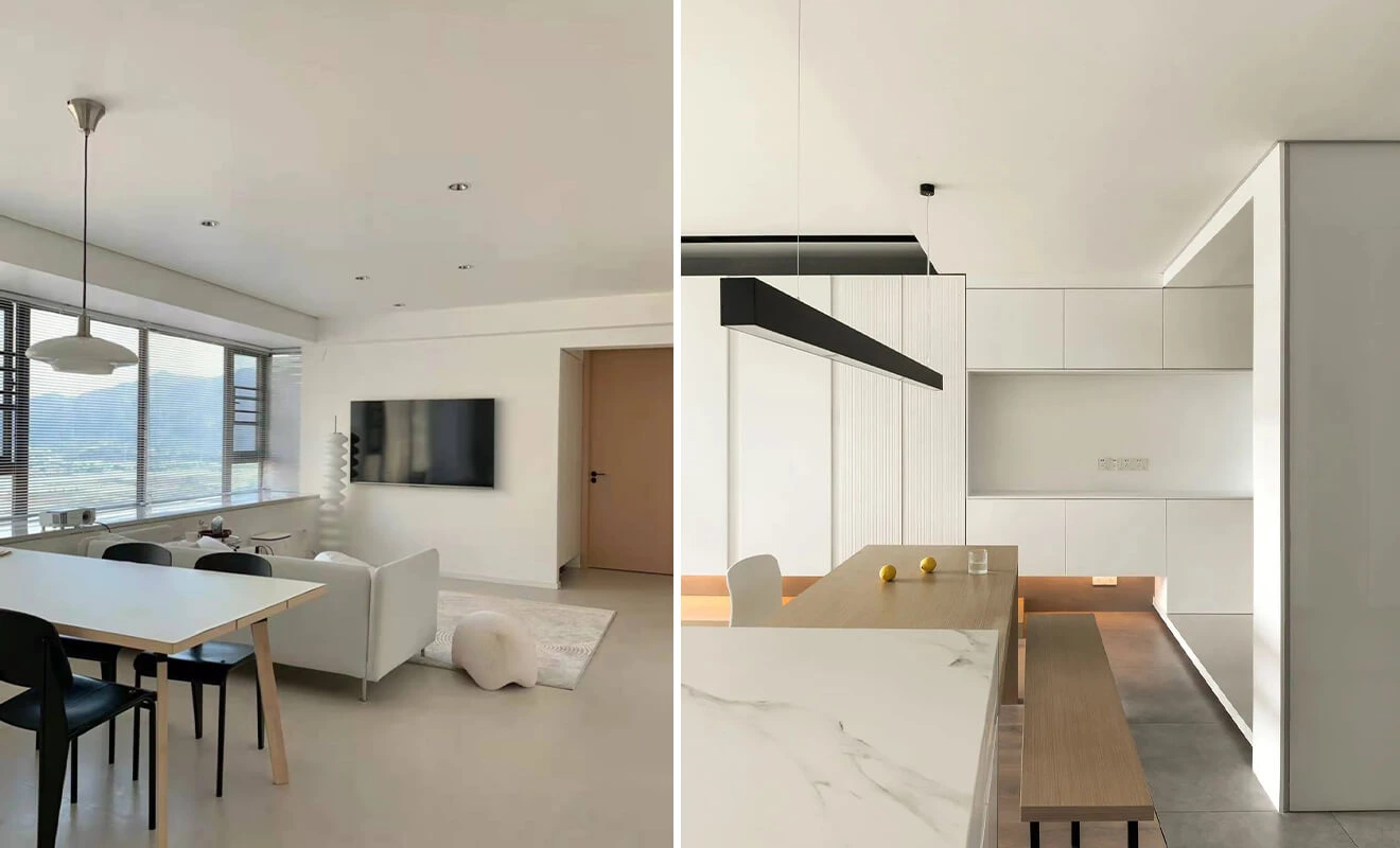
Alternatively, you can opt for the trendy no-ceiling design, where the ceiling is painted in cream color, creating a seamless effect between the walls and the ceiling. This visually enlarges the space and enhances its openness, making it particularly suitable for small-sized homes.
Wall decoration: The wall color should also be selected from the cream color palette. Whether it's latex paint, wallpaper, wall panels, or a simple white wall, each option can bring a different visual experience.
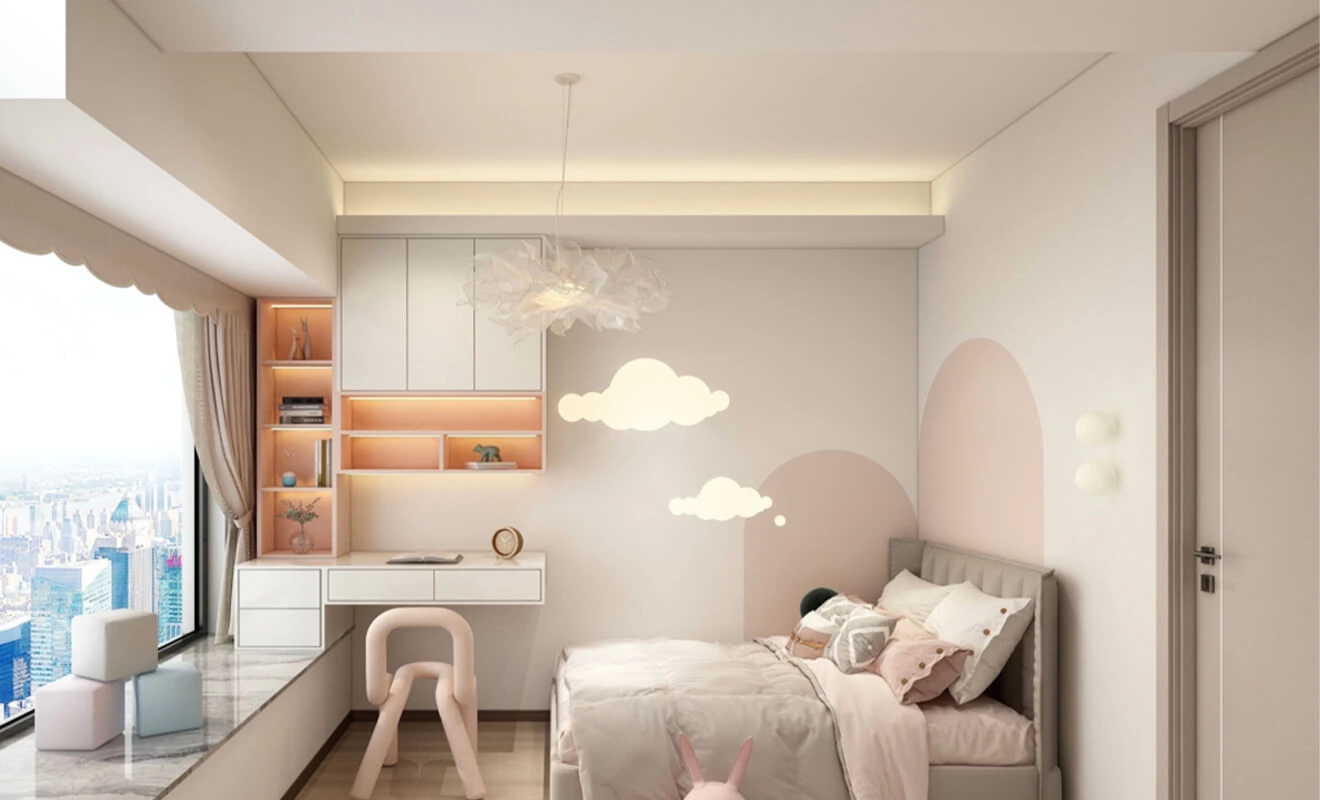
Wooden flooring: In cream-themed decor, the home leans towards a warm and gentle texture. The floor can be slightly darker than the wall color, such as hardwood or matte flooring, featuring a gradient of shades from light to dark, adding depth and a soft touch to the home. It's best to have consistent flooring throughout the space to create a sense of continuity.
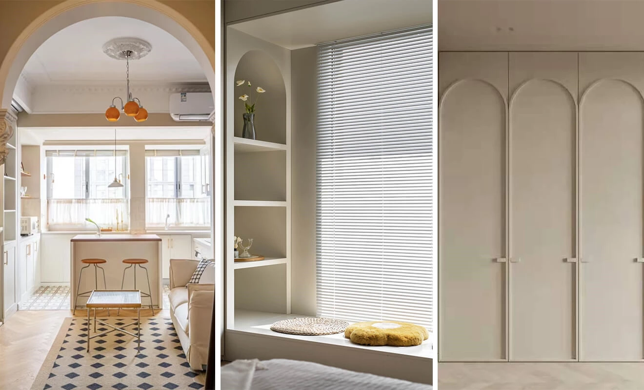
Curved designs: Curves outline the facades of the space, enhancing its playful nature while emphasizing its soft and lovable characteristics. Line decorations like curved cabinets and arched doors can fulfill the residents' desire for a gentle ambiance.
Hard-Furnishing Color Planning Notes
Choose the fixed elements first: floor, wall, ceiling, doors, large cabinets, and countertop. These surfaces occupy the greatest visual area and are expensive to change later. In a small room, use closely related values to keep the envelope open, then add depth through texture rather than many contrasting colors. Curves, panel joints, and recessed lighting should support the palette instead of becoming separate decorative themes.
For coordinated doors and wall details, explore interior doors and wall panel options before choosing paint, wood finish, or hardware colors independently.
Soft furnishings
The success of cream-themed decor relies on 70% of the overall coordination of soft furnishings, as they determine the overall tone.
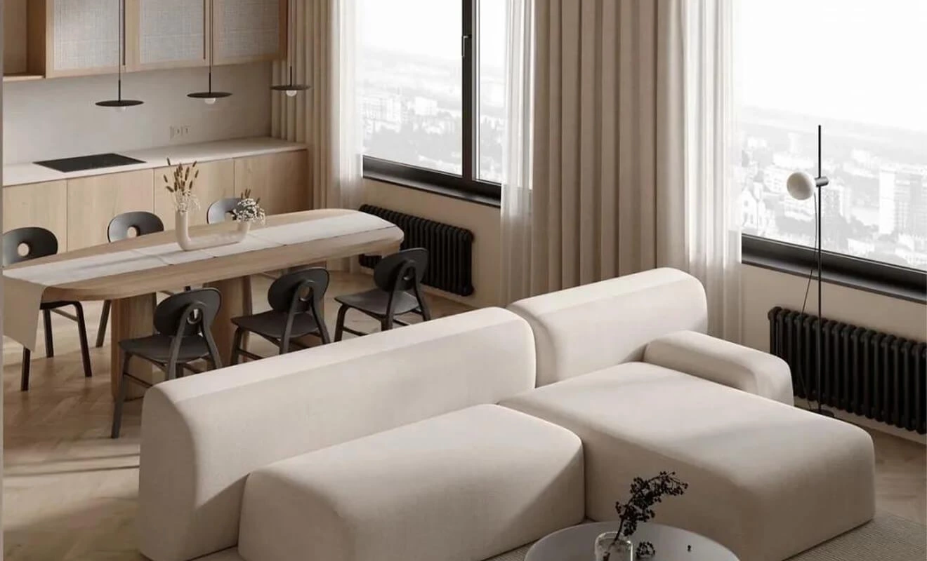
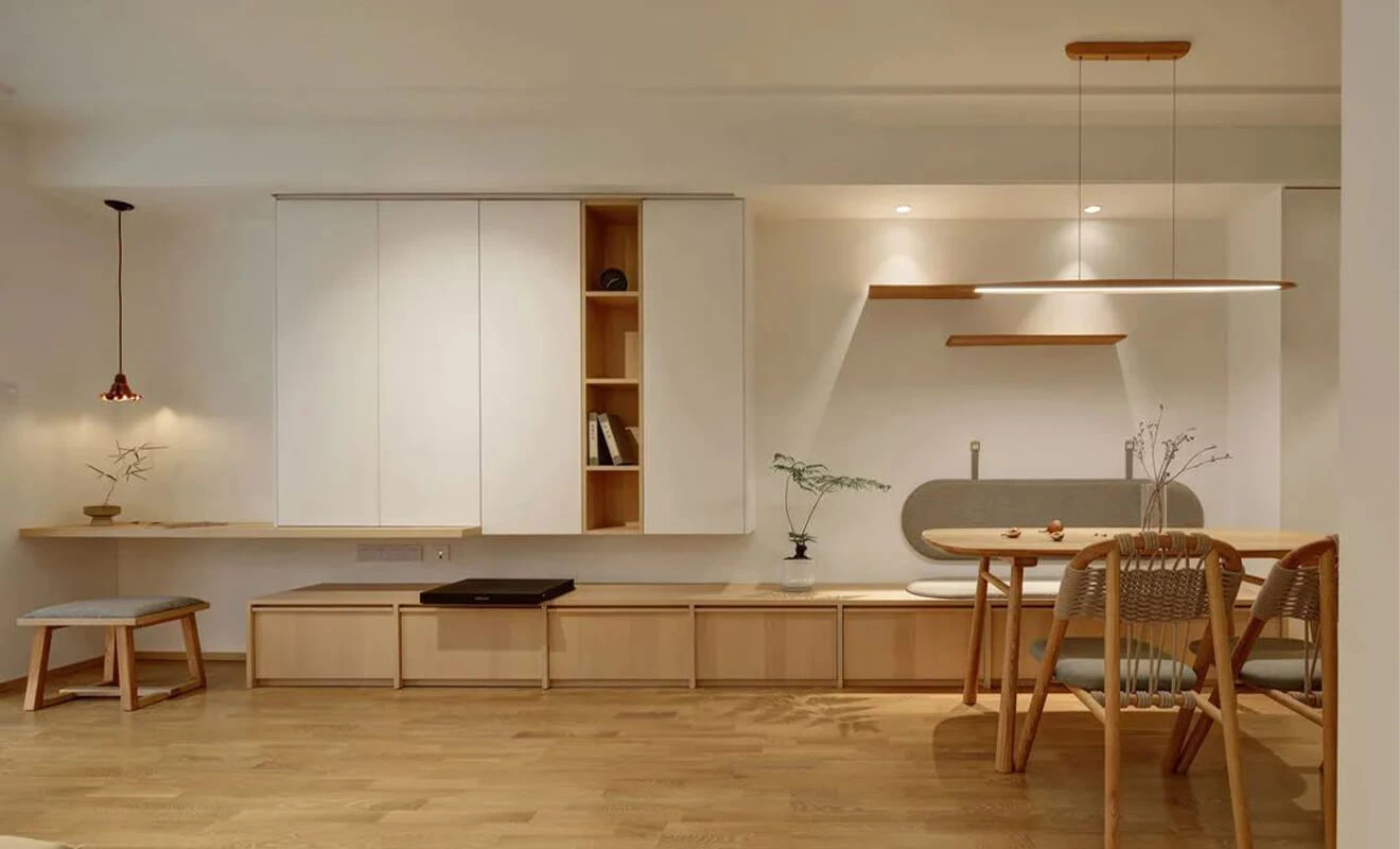
Textured furniture: When choosing furniture, it is recommended to select materials that have texture, such as wood, linen, and lamb's wool. These materials lean towards a natural effect and create a harmonious and gentle visual experience.
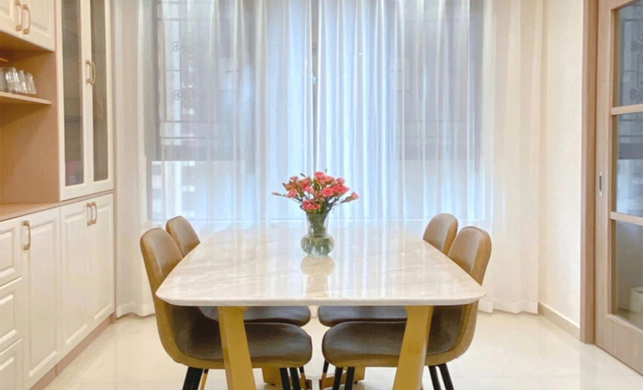
Subtle accents: Soft furnishings such as carpets and curtains are essential elements in cream-themed homes and can be used to accentuate details. Minimalist, French, and light luxury styles are more suitable for sheer fabrics and velvet, while Japanese and Nordic styles tend to favor cotton and linen materials.
Soft-Furnishing Color Planning Notes
Soft furnishings are a practical way to test warmth and contrast without changing fixed construction. Use texture to stop a cream room from feeling flat: a woven rug, linen curtain, wood grain, textured upholstery, or matte ceramic can create depth even when the colors remain close. The “70%” proportion in the original discussion is a useful design reminder about coordination, not a fixed formula for every home.
Colors
Every style has its core color palette, and cream-themed decor is no exception. Its color combinations can be divided into the following three categories:
Cream color: Cream color is a combination of white and yellow, representing elegance and translucency, exuding a rich yet pure sweetness. It is usually combined with white to balance the overall color scheme or create a combination of different shades within the same color palette, generating a sense of contrast and layers.
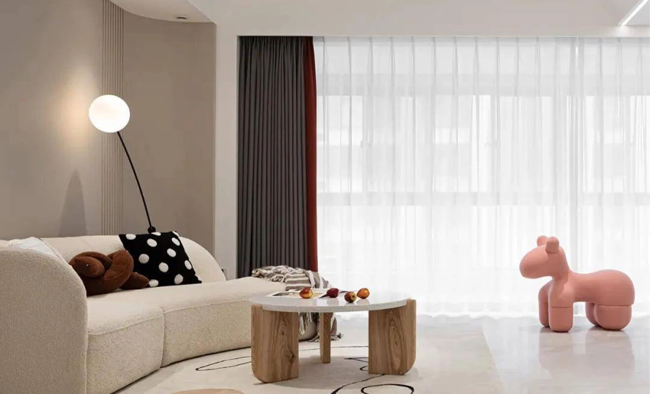
Milk tea color: Milk tea color is slightly deeper than cream color and is often combined with light gray or milky white. It embodies a gentle and slightly luxurious feel.
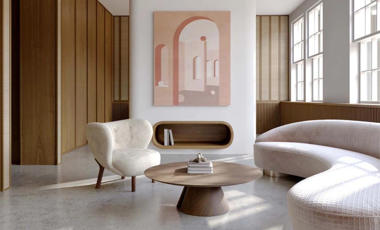
Milk coffee color: Milk coffee color has a rich and warm aroma, closely resembling earth tones. It emits a warm and autumnal vibe. It is recommended to pair it with wood materials to create a warm and soothing visual effect.
How to Build a Cream Color Palette
Start with one main cream sample, then compare it with the floor, countertop, cabinet doors, and the room's light. A cream that looks calm next to a warm oak floor may look yellow beside cool gray stone. Create a small palette board with the largest fixed finishes and look at it in the morning, afternoon, and evening before making a final decision.
- Use value contrast: Pair a light cream wall with a slightly deeper floor, cabinet, or upholstery tone so that the room has visual structure.
- Match undertones: Identify whether each cream, beige, white, and wood finish reads warm, neutral, gray, yellow, or pink.
- Limit accent colors: Use a small number of repeated accents, such as wood, bronze, soft green, or charcoal, rather than many unrelated colors.
- Use texture before extra color: Linen, wood, stone, and matte paint can add depth without breaking the soft palette.
- Plan lighting early: Lighting can change the perceived warmth of cream surfaces and should be tested with the final materials.
The U.S. Department of Energy provides general information on lighting choices and energy-saving options. For interior color decisions, use it as a general starting point and review actual bulbs, fixtures, and samples in the finished space.
Cream Cabinets, Wood and Countertop Pairings
Cream works especially well in cabinetry because it can feel warm without becoming overly dark. A cream cabinet finish can be paired with a light stone countertop for a quiet look, or with warm wood and deeper hardware for more contrast. The visual result depends on the door finish, sheen, handles, backsplash, and the amount of light entering the kitchen.
When planning the kitchen, compare custom kitchen cabinet designs with kitchen countertop options and finish samples. In bedrooms and dressing areas, related cream or wood accents can continue through custom bedroom wardrobes and storage.
Material Documentation and Indoor Air
Cream-colored home decor may use paint, wallpaper, wall panels, cabinetry, flooring, and textiles, each with different construction and maintenance requirements. For composite wood panels and adhesives, the U.S. Environmental Protection Agency's formaldehyde information provides general regulatory and consumer background. This does not mean every product in a cream palette is automatically certified or compliant; confirm the exact material documentation and destination-market requirements.
For larger renovations, a whole-home customization approach can coordinate the cream palette across cabinetry, doors, wall finishes, hardware and storage while allowing each room to retain its function.
Cream Color Home Decor Checklist
- Choose a main cream sample and identify its warm, neutral, or cool undertone.
- Compare it with the floor, countertop, cabinets, doors, and existing fixed finishes.
- Review samples in daylight and under the planned evening lighting.
- Use a clear hierarchy of main, supporting, and accent colors.
- Repeat a small number of wood, metal, or textile accents throughout the home.
- Check sheen, texture, cleaning needs, and likely fingerprint or wear areas.
- Coordinate paint, wall panels, cabinetry, hardware, and lighting before installation.
- Approve full material samples and drawings before production or painting begins.
Cream Color Home Decor FAQ
1. What colors go with cream in home decor?
Warm white, beige, milk-tea tones, light gray, natural wood, soft green, bronze, and selected darker accents can all work with cream. The best pairings depend on undertones and lighting.
2. Does cream color make a room look larger?
Light cream surfaces can help a room feel open when they are used with adequate lighting and a consistent color hierarchy. Room size also depends on layout, contrast, furniture scale, and window light.
3. Is cream a warm or cool color?
Cream is generally warm, but individual samples can lean yellow, beige, gray, pink, or neutral. Compare the actual sample with surrounding materials rather than relying only on a screen image.
4. Can cream cabinets work in a modern kitchen?
Yes. Cream cabinets can look modern when paired with clean door lines, suitable hardware, balanced countertop materials, and lighting. Matte and textured finishes can create a quieter result than high-gloss surfaces.
5. How do I stop a cream room from looking plain?
Add texture, controlled value contrast, and a few repeated accents. Wood grain, linen, stone, matte metal, plants, and carefully selected artwork can add depth without adding many colors.
6. What flooring works with cream walls?
Warm wood, matte neutral tile, and floors slightly deeper than the walls are common choices. Review the floor and wall samples together in the actual room lighting.
7. Should ceilings be the same cream color as walls?
They can be, especially when a continuous envelope is desired. A lighter ceiling can also increase contrast and perceived height. The best choice depends on ceiling height, light, and room proportions.
8. Which lighting is best for cream interiors?
Choose lighting after reviewing the cream samples. Color temperature, beam direction, fixture finish, and daylight all affect how warm or cool the final palette appears.
9. Can cream color work with dark wood?
Yes. Dark wood can give cream walls and upholstery more depth and contrast. Balance it with enough light-colored surface area and avoid combining too many unrelated wood tones.
10. Can cream color be used in bedrooms?
Yes. Cream can create a calm bedroom when the walls, headboard, bedding, bedside cabinets, and lighting are coordinated around a limited palette.
11. What should I test before committing to a cream color?
Test paint, cabinet, countertop, flooring, fabric, and lighting samples together at different times of day. Check their undertones, sheen, texture, and relationship to existing finishes.
12. How do I coordinate cream color throughout a whole house?
Use one main cream family, then repeat related whites, beiges, wood tones, and accents in different proportions by room. This creates continuity without making every room identical.
Conclusion: Create Softness with a Clear Color Structure
The most effective cream color home decor is not one color repeated everywhere. It is a balanced palette of cream, white, beige, wood, and carefully controlled accents that works with the room's light, materials, and daily use.
Start with the fixed finishes, test real samples, and coordinate cabinetry, flooring, walls, textiles, and lighting as one system. This produces a soft, warm interior that still feels layered and intentional.