Why Kitchen Color Choices Matter More Than Most Homeowners Think
Most homeowners think kitchen design is mainly about layout, storage, or cabinet style.
In reality, color is often the factor that determines whether a kitchen feels expensive, comfortable, timeless, or completely wrong.
Over the years, we’ve worked on villa kitchens, apartments, and full-house customization projects across the USA, Australia, Canada, and the Middle East. One thing becomes very clear after seeing hundreds of completed kitchens:
Two kitchens can use the same cabinet layout and materials, but completely different color choices can change the entire feeling of the space.
A poorly selected kitchen color scheme can make:
- A luxury kitchen feels cold
- A large kitchen feels empty
- A small kitchen feels crowded
- expensive materials look cheap
Meanwhile, the right color combination can:
- improve perceived space
- create warmth
- increase resale appeal
- reduce visual fatigue
- make the kitchen feel professionally designed
The biggest mistake most homeowners make is choosing colors emotionally instead of strategically.
They save random Pinterest photos.
They copy showroom kitchens.
They follow trends without considering:
- lighting
- flooring
- maintenance
- family lifestyle
- long-term resale value
The result?
A kitchen that looked beautiful online but feels uncomfortable in daily life.
This guide explains how professional designers actually choose kitchen colors for real homes—not just for social media photos.
Understanding Your Kitchen Before Choosing Colors
Your Lifestyle Should Decide the Color Strategy
A kitchen used by a family of five should not follow the same color strategy as a luxury vacation villa.
Good kitchen design starts with understanding how the space will actually be used.
Busy Family Kitchens
For families with children, heavy cooking habits, or frequent kitchen activity, practicality matters just as much as aesthetics.
This is why overly glossy white kitchens often become frustrating over time. Fingerprints, oil marks, and scratches become highly visible under strong lighting.
In real projects, we often recommend:
- warm white
- greige
- oak wood grain
- textured matte finishes
These colors:
- hide fingerprints better
- reduce visible wear
- age more naturally
- feel warmer in daily use
Dark matte black kitchens may look dramatic online, but in active family homes, they often require constant cleaning.
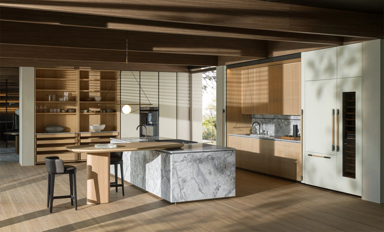
Luxury kitchens usually focus on layering rather than using one dominant color.
The goal is not simply “beautiful cabinets.”
The goal is to create visual depth.
Instead of flat color schemes, high-end kitchens often combine:
- natural wood
- marble textures
- soft metallic accents
- warm neutral cabinetry
For example:
- walnut + warm white marble
- smoked oak + champagne gold hardware
- greige cabinets + travertine stone
These combinations create a more expensive and architectural appearance.
The biggest difference between average kitchens and luxury kitchens is usually material coordination—not cabinet price alone.
Small Apartments & Rental Properties
For apartments and investment properties, safer color strategies usually perform better.
Extremely personalized colors may reduce resale appeal.
This is why developers often prefer:
- soft white
- light oak
- beige-grey combinations
- warm neutrals
These colors appeal to a broader audience and make smaller kitchens feel brighter and larger.
In rental projects, textured finishes are also preferred because they hide scratches and daily wear better.
Minimalist kitchens have changed dramatically in recent years.
Earlier minimalist trends focused on:
- pure white
- glossy surfaces
- cold grey palettes
Today, modern luxury minimalism is moving toward:
- warmer neutrals
- earthy textures
- soft matte finishes
Many homeowners now realize that extremely cold minimalist kitchens can feel emotionally uncomfortable after long-term use.
Warm minimalism creates:
- calmness
- softness
- visual balance
- long-term comfort
How Lighting Completely Changes Kitchen Colors
Natural Light Analysis
Lighting is one of the most ignored aspects of kitchen color selection.
A cabinet color that looks beautiful in a showroom may look completely different inside your actual home.
North-Facing Kitchens
North-facing kitchens usually receive cooler natural light.
This often causes:
- Grey cabinets appear dull
- white kitchens to feel cold
- Dark kitchens to feel heavy
For these spaces, warmer cabinet tones work much better.
Recommended options include:
- warm white
- creamy beige
- natural oak
- walnut
- greige
These colors help balance cooler lighting conditions.
South-Facing Kitchens
South-facing kitchens receive stronger and warmer sunlight.
This allows more flexibility in cabinet color selection.
Even darker colors like:
- charcoal
- deep walnut
- matte black
It can work beautifully when balanced correctly.
However, excessive warm sunlight may also make yellow-toned cabinetry appear overly warm.
This is why professional designers carefully test samples under real lighting conditions before finalizing materials.
Artificial Lighting Matters Too
Artificial lighting changes color perception significantly.
Warm LED lighting creates:
- softer atmospheres
- warmer wood tones
- more luxurious environments
Cool white lighting creates:
- sharper contrasts
- cleaner modern aesthetics
- brighter visual appearance
Unfortunately, many homeowners only evaluate cabinet colors under showroom lighting, which often differs greatly from residential environments.
Under-Cabinet Lighting Effects
Under-cabinet lighting is no longer just functional.
It now plays a major role in creating a luxury atmosphere.
Good lighting can:
- highlight stone textures
- create depth
- soften shadows
- Enhance cabinet finishes
Especially in darker kitchens, lighting becomes essential for preventing the space from feeling visually heavy.
Choosing Colors Based on Kitchen Size & Layout
Small Kitchen Color Strategies
Small kitchens benefit from visual simplicity.
Too many contrasting colors can make compact kitchens feel cluttered.
This is why lighter palettes often work better:
- soft white
- warm beige
- light oak
- greige
These tones reflect light and improve perceived space.

Mistakes That Make Small Kitchens Feel Crowded
One of the most common mistakes is excessive contrast.
Examples include:
- black cabinets + dark flooring
- multiple wood tones
- overly busy veining patterns
Instead of feeling luxurious, these kitchens often feel visually compressed.
In smaller kitchens, simplicity creates elegance.
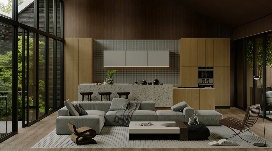
Large Open Kitchen Strategies
Large kitchens require the opposite approach.
Without enough contrast or layering, oversized kitchens can feel empty and flat.
This is why many luxury open kitchens use:
- dark islands
- lighter perimeter cabinetry
- statement stone countertops
- layered materials
Contrast helps define zones and create visual focus.
Creating Warmth in Oversized Spaces
Large kitchens also risk feeling emotionally cold.
Warmth can be introduced through:
- walnut textures
- warm lighting
- soft neutral cabinetry
- natural stone surfaces
Wood textures are especially important because they soften modern architectural spaces.
The Psychology Behind Popular Kitchen Colors
White Kitchens — Timeless but Easy to Misuse
White kitchens remain popular because they:
- feel clean
- improve brightness
- create timeless appeal
However, not all white kitchens succeed.
Cool white tones often feel sterile when combined with:
- grey flooring
- cool lighting
- glossy finishes
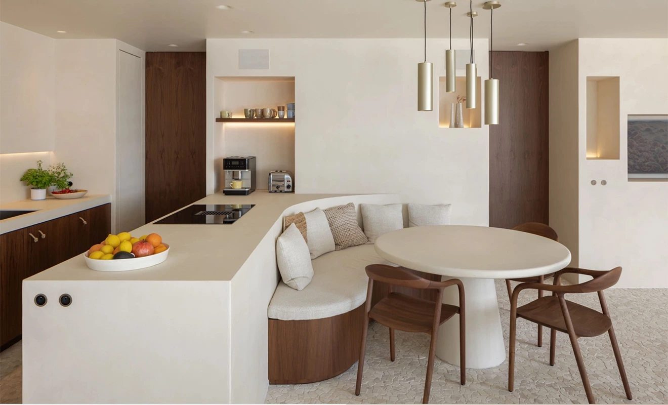
Warm whites create a much softer and more welcoming atmosphere.
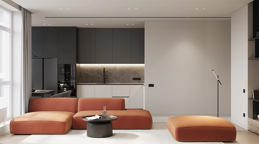
Grey Kitchens — Modern, Sophisticated, Risky
Grey kitchens became globally popular during the modern minimalist trend.
But many grey kitchens now feel dated because they were designed with overly cold tones.
Today’s more successful grey kitchens use:
- warm greige
- taupe-grey blends
- textured matte finishes
This creates sophistication without emotional coldness.
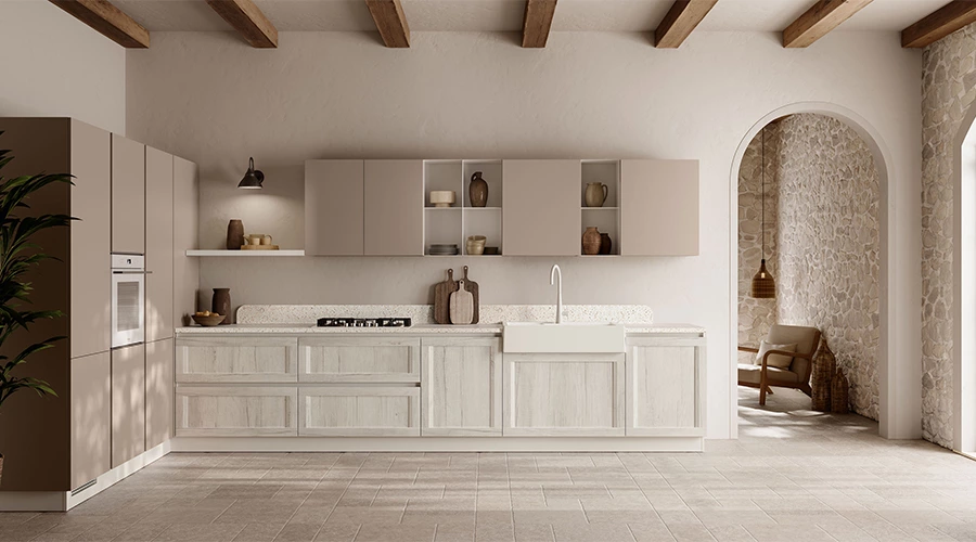
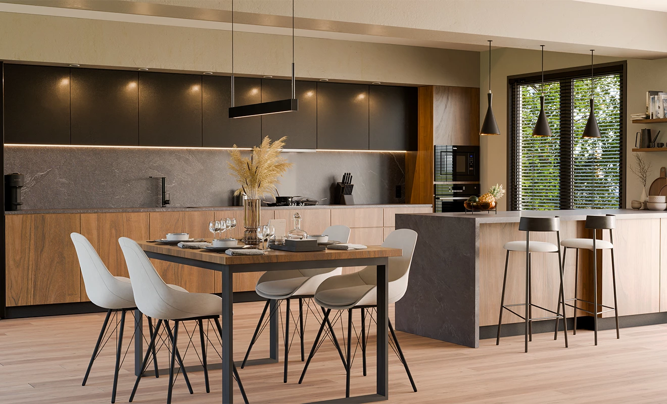
Wood Tone Kitchens — The Rise of Warm Luxury
Wood textures are dominating kitchen trends again.
Why?
Because homeowners are moving away from cold perfection and toward natural warmth.
Popular wood finishes include:
- white oak
- walnut
- smoked oak
- ash wood
Wood creates:
- emotional comfort
- visual texture
- timeless appeal
Even modern luxury kitchens now heavily incorporate natural wood elements.
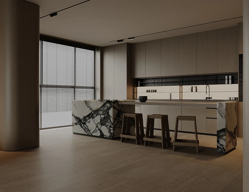
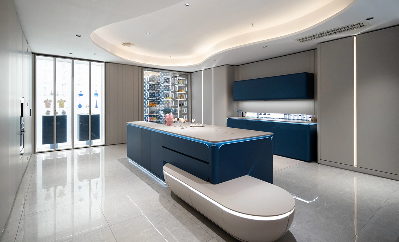
Black Kitchens — Dramatic Luxury
Black kitchens can look incredibly sophisticated when executed correctly.
But they require:
- sufficient lighting
- balanced materials
- larger spaces
Without proper balance, black kitchens can feel oppressive.
This is why designers usually combine black cabinetry with:
- marble countertops
- wood textures
- warm metallic accents
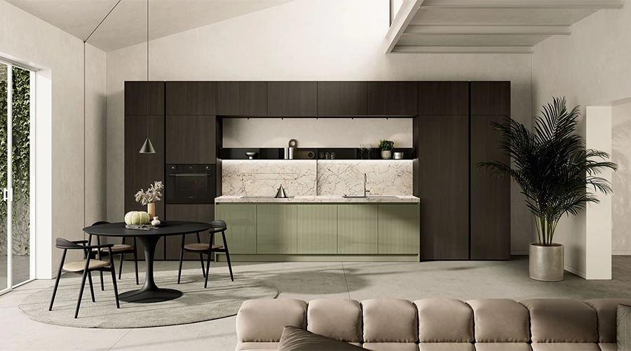
Green Kitchens — Soft Luxury Trend
Sage green kitchens are becoming increasingly popular in Europe and Australia.
They create:
- softness
- organic warmth
- relaxed luxury feeling
Green cabinetry pairs especially well with:
- marble surfaces
- brushed brass hardware
- natural oak flooring
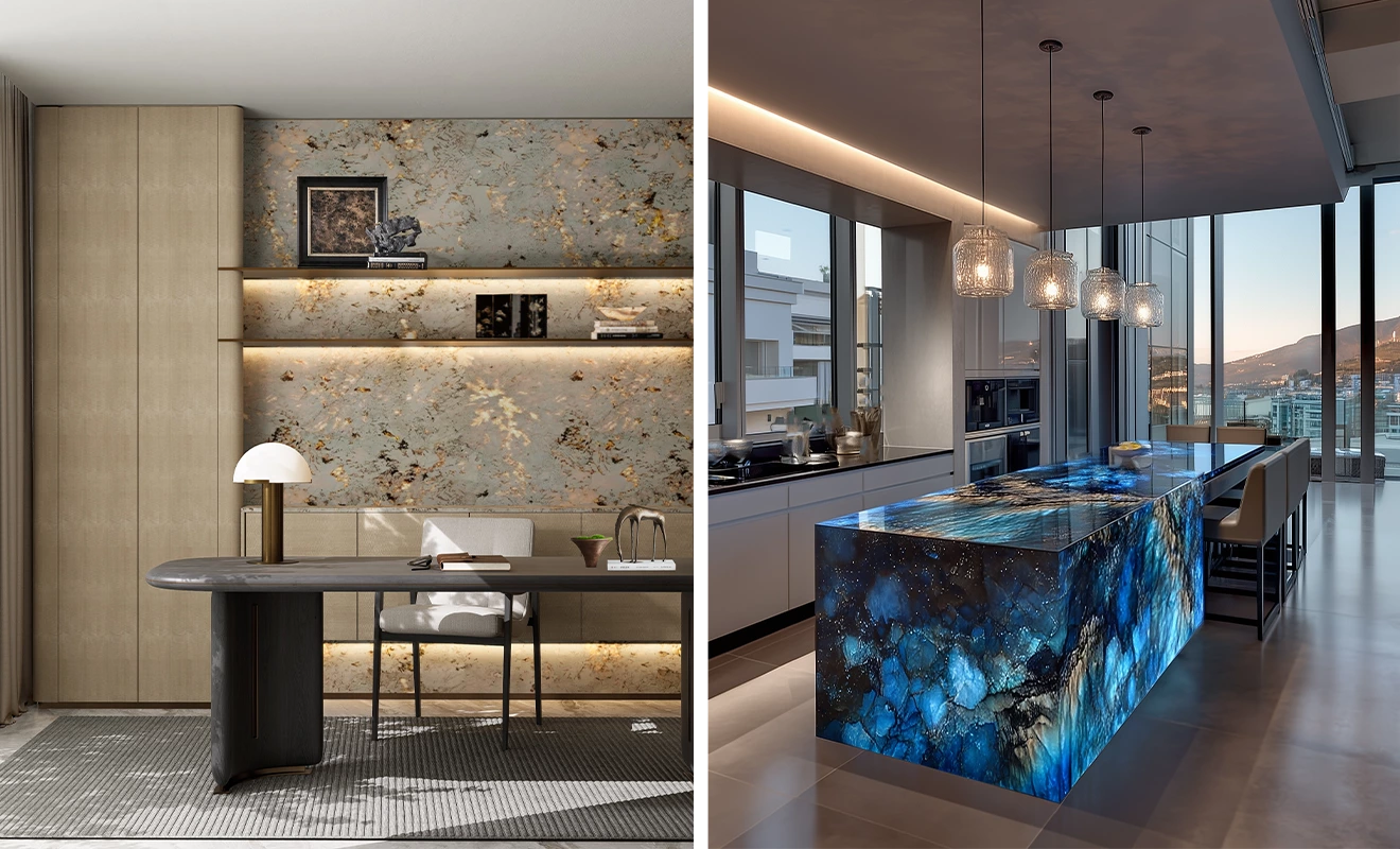
Blue Kitchens — Elegant but Difficult to Balance
Blue kitchens require careful coordination.
Navy blue can look extremely luxurious when paired with:
- white marble
- gold accents
- walnut textures
However, overly cool blue tones may create cold environments if the lighting is poor.
How to Match Cabinet Colors With Countertops
White Cabinets + Marble Surfaces
This remains one of the safest luxury combinations.
Why?
Because marble adds movement and texture, while white cabinetry keeps the kitchen visually clean.
This combination works especially well in:
- transitional kitchens
- luxury villas
- modern classic interiors
Wood Cabinets + Quartz Surfaces
This combination has become extremely popular globally.
Quartz offers:
- durability
- lower maintenance
- clean modern appearance
Meanwhile, wood cabinetry introduces warmth.
Together, they create balanced modern kitchens.
Dark Cabinets + Light Countertops
Dark cabinetry creates a dramatic contrast.
But using dark countertops as well can sometimes make kitchens feel too heavy.
This is why designers often balance dark cabinetry with:
- light quartz
- marble surfaces
- brighter backsplashes
Contrast creates visual clarity.
Hardware & Finish Selection
Why Hardware Colors Matter More Than People Expect
Cabinet hardware acts like jewelry for the kitchen.
The wrong hardware color can completely disrupt the design balance.
Black Hardware
Black handles work well in:
- modern kitchens
- minimalist spaces
- light cabinetry combinations
They create strong visual definition.
Brass & Gold Hardware
Warm metallic hardware adds:
- luxury
- warmth
- elegance
Especially when combined with:
- walnut cabinetry
- green kitchens
- marble countertops
Brass finishes remain one of the strongest luxury trends for 2026.
Matte vs Gloss Cabinet Finishes
Matte finishes dominate modern luxury kitchens because they:
- soften reflections
- feel more premium
- hide fingerprints better
Gloss finishes still work well in:
- compact apartments
- ultra-modern spaces
- high-reflection environments
But they usually require more maintenance.
Timeless Kitchen Colors vs Trend-Driven Designs
Timeless Kitchen Cabinet Colors
The safest long-term kitchen colors include:
- warm white
- natural oak
- walnut
- greige
- soft taupe
These colors:
- age well
- remain flexible
- improve resale value
Trend Colors for 2026
Current trends include:
- deep green
- charcoal black
- clay beige
- smoky blue
- textured wood finishes
However, trends should be balanced carefully with long-term practicality.
The Biggest Kitchen Color Mistakes Homeowners Make
Choosing Colors From Small Samples Only
Tiny samples rarely represent the full kitchen appearance accurately.
Lighting, surrounding materials, and scale all affect perception.
Always review:
- large panels
- real slab samples
- full lighting conditions
Ignoring Flooring & Wall Coordination
Cabinets should never be selected independently.
Kitchen flooring strongly affects:
- warmth
- contrast
- color balance
Professional designers usually start with flooring and countertops first.
Copying Pinterest Kitchens Blindly
Many social media kitchens are designed mainly for photography.
Real-life kitchens must also consider:
- maintenance
- comfort
- lighting
- practicality
What looks beautiful online may feel uncomfortable daily.
Global Kitchen Color Trends by Region
USA Kitchen Trends
American kitchens increasingly favor:
- warm transitional styles
- white oak
- soft white cabinetry
- large islands
Australia Kitchen Trends
Australian kitchens often emphasize:
- natural textures
- earthy palettes
- relaxed organic minimalism
Middle East Luxury Kitchen Trends
Middle Eastern luxury kitchens commonly feature:
- dramatic marble
- dark wood
- strong contrast
- metallic accents
European Kitchen Trends
European kitchens are moving toward:
- handleless systems
- ultra-matte surfaces
- earthy tones
- minimalist architecture
How Professional Designers Actually Choose Kitchen Colors
Professional designers rarely start with cabinet color first.
The usual sequence is:
- flooring
- countertop
- cabinetry
- backsplash
- hardware
- lighting
This creates stronger visual harmony.
Most homeowners accidentally reverse this process.

Best Kitchen Color Combinations for 2026
Warm White + Walnut
Balanced luxury with timeless warmth.
Sage Green + Marble White
Soft European elegance with natural calmness.
Matte Greige + Oak
Modern minimalism without emotional coldness.
Charcoal + Light Quartz
Strong architectural contrast with modern sophistication.
Natural Oak + Cream White
Comfortable, timeless, and globally appealing.
Cost, Maintenance & Long-Term Value
Which Colors Hide Wear Best
Best-performing colors include:
- textured wood grain
- greige
- medium-tone oak
- matte taupe
These finishes age more naturally over time.
Which Finishes Require More Maintenance
Higher-maintenance finishes include:
- glossy black
- pure matte black
- high-gloss white
These surfaces reveal fingerprints and scratches more easily.
Which Kitchen Colors Help Resale Value
Neutral warm kitchens usually achieve the best resale results.
Extremely personalized colors may reduce buyer appeal.

Final Thoughts — The Best Kitchen Color Is the One That Fits Your Real Life
The most beautiful kitchen is not necessarily the trendiest one.
The best kitchen color strategy balances:
- lighting
- lifestyle
- maintenance
- emotional comfort
- long-term durability
A professionally designed kitchen should still feel comfortable years later—not just impressive on installation day.
Get Professional Kitchen Color Advice From ALLURE
At ALLURE, we help homeowners, builders, and developers create kitchen systems that combine:
- luxury aesthetics
- practical functionality
- long-term durability
Whether you're planning:
- a villa project
- apartment development
- kitchen renovation
- or full-house customization
Our team can help you:
- Choose the right cabinet colors
- match countertops and materials
- optimize design and budget
- Create a timeless kitchen tailored to your lifestyle
Contact ALLURE today for professional kitchen design consultation and factory-direct customization solutions.


